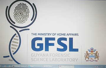
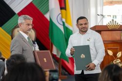
The logo for the Guyana Forensic Science Laboratory was unveiled yesterday and winning designer Keith Bernard was awarded at a ceremony at the Ministry of Home Affairs.
The entries for the competition to the design the logo were collected during a three-week period in April and were judged by a panel consisting of members of the University of Guyana, the Guyana National Bureau of Standards, the Environmental Protection Agency as well as the private sector.
Bernard, in his presentation of the logo, explained that his design is a modernist concept based on the meaning of Forensic Science, which to him is investigation. He indicated that the magnifying glass is a representation of the oldest form of investigation and that the DNA strand signifies the depth of the study.
Minister of Home Affairs Clement Rohee said that he too believed that the logo is an adequate representation of what forensic science is about, and that the logo in his opinion is quite appropriate.
Speaking at the ceremony, the minister acknowledged that this is one of the last steps towards to the commissioning of the laboratory.
He admitted that he is more optimistic about the opening of the facility than he was six months ago and asserted that while major work for the facility has been completed, there are some minor issues that need to be resolved.
This is not the first win for the graphic designer from Pixel Plus Creations. In 2007, Bernard created the winning Carifesta X logo.


